

The Psychology of Colour for Your Therapy Website: How to Choose Your Colours
As therapists, we understand the impact of the environment on our clients' emotions. Your website's colour palette is no different - it's the digital equivalent of your therapy room's ambiance.
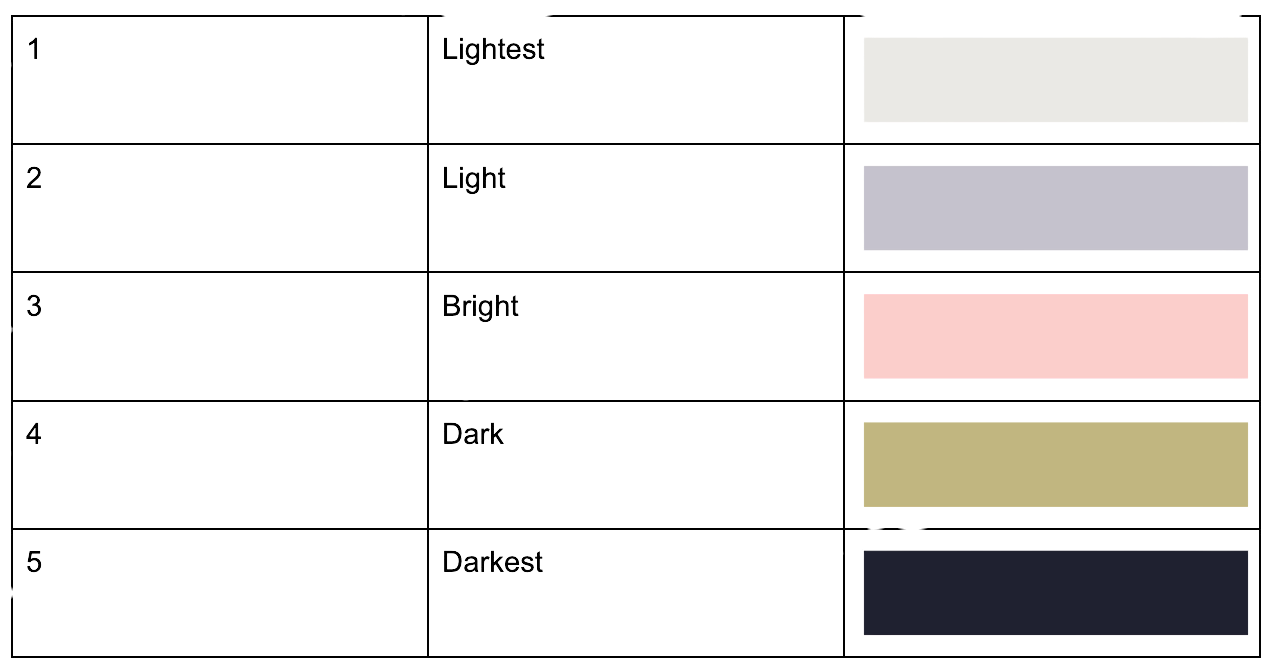
The 5 Colour Framework
Professional grade websites typically use 5 key colours:
Lightest (usually white/off-white) - For readability
Light (brand color) - For main sections
Bright (accent) - For calls-to-action
Dark (brand color) - For depth
Darkest (usually black/off-black) - For text
The biggest mistake therapists make?
Most therapists either:
Default to template colours of website builders such as Wix or Sparespace or whatever their website designer suggests
Problem: Misses opportunity to connect directly to clients and makes websites look generic.Choose personal favourite colours
Problem: Forgets about client specific appeal.Pick trendy colours
Problem: No strategic purpose.
How to choose colours strategically:
Consider Three Factors:
Your Clinical Approach: How can you reference this in colour?
CBT? Consider structured, clear colours
Humanistic? Warmer, inviting tones
Psychodynamic? Deep, thoughtful shades
Your Ideal Client: How can you target them through colour?
Professional adults? Sophisticated, clean palettes
Anxiety clients? Calming, soft tones
Youth? Energetic but not overwhelming colours
Perinatal? Gentle, nurturing shades
Your Brand Personality: How can you show this through colour?
Traditional practice? Classic, professional colours
Modern approach? Contemporary, fresh palettes
Holistic focus? Natural, organic tones
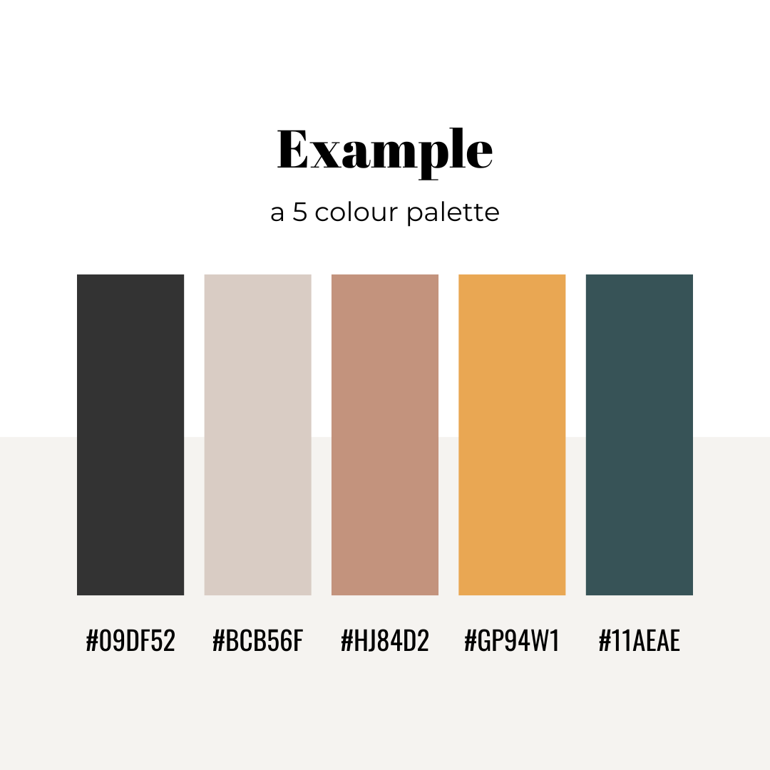
Example:
A website targeting younger adult females. CBT therapy with a modern approach. Colours chosen to suggest: forward thinking, structured, safe, modern and calming:
Resources To Help:
Canva Color Palette Generator https://www.canva.com/colors/color-palettes/
Color Psychology Guide: https://www.colorpsychology.org/
ChatGPT or Claude.ai prompt:
I'm creating a website for my [THERAPY PRACTICE - EXPLAIN WHAT YOU DO AND WHO YOU TARGET]. I need help deciding the colour scheme, using colour psychology. The colours need to appeal to my client, whilst conveying my values of [MY VALUES]. Every professional website follows this formula:The 5-Colour Framework:
Every professional website typically uses 5 key colors: Lightest (usually white/off-white)
For readability - Light (brand colour)
For main sections Bright (accent)
For calls-to-action Dark (brand colour)
For depth Darkest (usually black/off-black) - For text.
Please help me decide colours for a website that is for [MY THERAPY PRACTICE WHO TARGETS YOUR AUDIENCE].
PRO TIP: Remember, your website colours should feel like a warm handshake between your professional identity and your client's needs.